Redesign of Windows PC
Optimization Tool
Role: Senior Product Designer (End-to-End)
Goal: Redesign a desktop app for PC optimization.
My goals were to analyze and improve the UX, simplify the interface, cut the clutter, and make it actually easy to use.
Old Design Problems
Unclear structure. Сonfusing categories, each page looked like a separate project
Old-fashioned interface, poor visual hierarchy
Unclear how to make quick computer cleanup
Missing descriptions. Users didn't meanings of each categories
Confusing navigation. Users couldn't distinguish clickable elements from graphics

Impovements
Making well-organized categories with unified UX across all sections
Adding descriptions for each category for more understanding
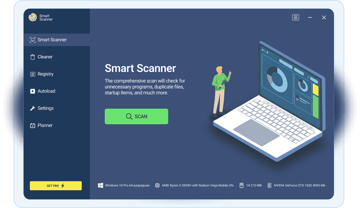
Adding simple function "Smart Scan" for those who doesn't want to overthink, just wants to make one-click automatic cleanup function
Clear CTA. We want people get Pro Version, but in old design they even can not find CTA button
Modern design. Updated interface while maintaining brand identity

Smart scan user flow
I designed full user flows, covering primary and alternative paths, including error states and edge cases. Here you can see the primary flow for the Smart Scanner.

Categories
You can see different categories below, but the UX is the same. The action button is always in the same place. Every category has a hero title and a subtitle explaining what that feature does. All categories are on the left sidebar. In the bottom left, there's a CTA button (Get PRO) that catches the eye without pulling the user away from what they're actually trying to do.
